Loud, Proud & Punny: Why Bright Colors and Clever Taglines Rule in 2025
Loud, Proud & Punny: Why Bright Colors and Clever Taglines Rule in 2025
In the oversaturated world of branding, sometimes it pays to shout a little.
Gone are the days of “playing it safe” with muted palettes and forgettable slogans. In 2025, brands that pop — literally and figuratively — are the ones that stop the scroll, catch the eye, and stay in your head (and heart) long after first glance.
So what’s working now?
🎨
Bright colors.
🔤
Pun-filled taglines.
💡
And a bold personality to match.
Let’s break down why this playful combo is taking over — and how your brand can use it without looking like a highlighter explosion.
Bright Colors = Instant Brand Recall
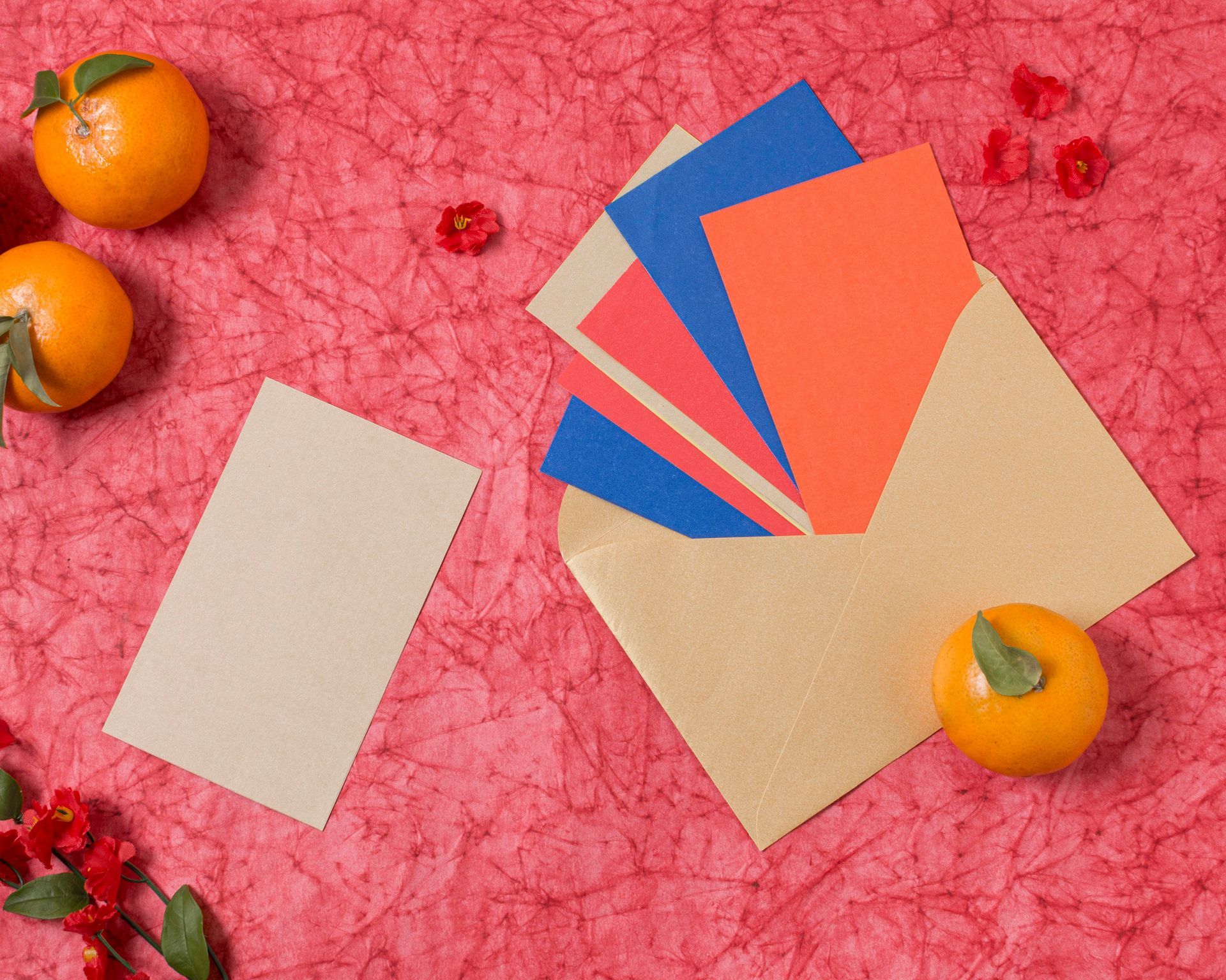
Think hot pink, electric blue, neon green, juicy orange.
Bright colors spark emotion, command attention, and — when used right — create instant visual recognition. Brands in 2025 are embracing vibrant palettes not just to stand out, but to signal energy, confidence, and approachability.
But why do they work so well?
- They're impossible to ignore.
- They photograph beautifully for social media.
- They evoke emotion fast (yellow = joy, red = urgency, pink = creativity).
- They create a unique fingerprint in a sea of beige brands.
🟢 Tip: Use one bright accent color consistently across packaging, social media, and your website for a unified “pop” effect.
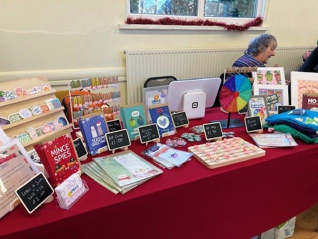
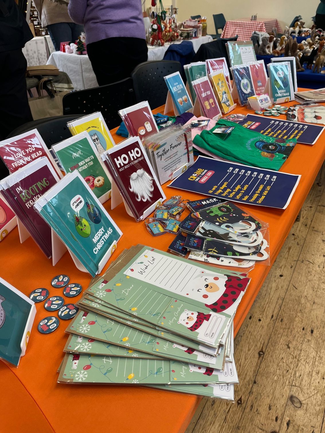
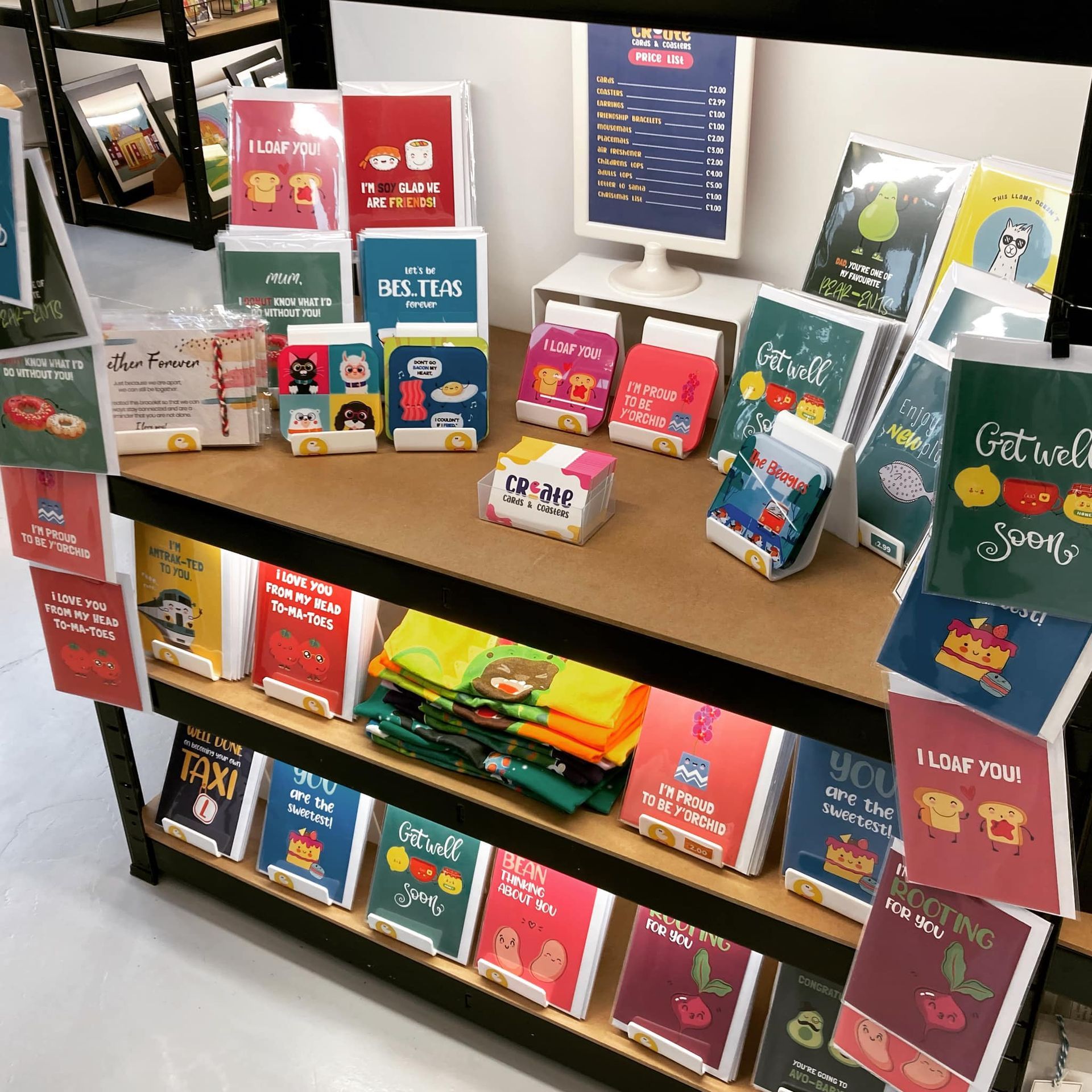
Puns: Because Humor = Human
In a world of corporate jargon and AI-generated sameness, a clever pun instantly sets you apart.
Whether it’s a tagline, product name, or CTA, puns tell the world:
🗣️ “Hey, we’re fun. We’re human. We don’t take ourselves too seriously.”
Some pun-believable examples:
- A coffee brand with “Espresso Yourself” on their packaging
- A cleaning brand that says “Mess Around and Find Out”
- A plant shop using “Leaf It to Us” as their tagline
- A fitness app with: “Sweat Now, Glow Later”
Why do pun taglines work?
- They’re memorable
- They create brand personality
- They spark smiles — or shares
- They turn language into a playground
🤓 Bonus: Studies show humor increases ad recall and purchase intent. So yes, being punny can literally boost your bottom line.
Bright + Punny = Bold Brand Identity
When you combine vibrant color with a witty voice, you're doing more than creating a “fun vibe” — you're crafting a brand that feels:
✅ Confident
✅ Creative
✅ Approachable
✅ Refreshingly different
Think about brands like Oatly, Liquid Death, Glossier, or Poppi. They don’t just sell products — they sell personality. And in 2025, personality sells.
How to Do It Right (Without Overdoing It)
Want to bring some color and cleverness into your branding? Here’s how to keep it smart, not sloppy:
✅ Do:
- Pair bold colors with clean layouts
- Use humor that matches your audience's tone
- Test different taglines with real people
- Match visuals with voice (if your tagline is cheeky, your design should be too)
❌ Don’t:
- Use all the colors at once (unless you're Lisa Frank)
- Force a pun where it doesn't fit
- Sacrifice clarity for cleverness
- Be “quirky” just for the sake of it — make sure it aligns with your mission
Wrap-Up: It's Cool to Be Bold in 2025
Bright colors and punny taglines aren’t just trendy — they’re strategic.
They help your brand:
- Stand out in crowded feeds
- Feel fun and friendly
- Stick in people’s memories
- Spark conversation (and conversion)
So go ahead — turn up the volume on your brand.
Get a little loud, get a little cheeky — and don’t be afraid to pun and done it.